As a graphic designer, pastor and web designer I do a lot of research on the internet. I look up churches and the first page I go to is their About page. What most don’t realize, the About page is the most visited page a website has.
Most churches don’t think much of their About page. It’s just a page you add some text to, who you are your vision etc. Yet, if a website visitor doesn’t like your about page, they’ll bounce off and probably never even visit the church.
Most don’t view their About page as an opportunity. Usually it consumes the idea that the page is about the church and not the guest.
So how do we make our church and ministry about pages better? Let me give you 5 tips to crafting a better About page.
1. It’s not about you. People are personal. They want to know you care. They don’t care how many years or accolades your church has, they want to know what’s in it for them. One of the best ways to do that is either write in first or second person. Use I, We, You etc… We’re not writing a book – we want to be personal.
2. Begin with your guests priorities. I read a lot, and most pages are written, as Michael Hyatt, would call, “Upsidedown.” In other words, most churches begin with their own biography. Who they are. They don’t focus on the needs or priorities of the reader. Begin by writing from their persecutive, not yours.
3. Tell them about who you are. As a guest, once I know what you can do for me, I want to know who you are and why you can help me. Don’t give a whole story, tell them in two to three sentences.
4. Write conversationally. Don’t be too analytical or complex. Our website guests what to know that you care. They want to connect on a personal level. I encourage you to write as if you’re sitting in a coffee shop with a new church prospect. Have a conversation.
5. Tell them how to contact you. They will want to know where to get a hold of you. Provide a contact link or better yet, a contact form at the bottom of the page. This way, they know if they send you an email, they’ll have a good chance to have their questions answered.
If you take these suggestions, you’ll find a better crafted About page. Use mine as an example Maybe even create a NEW HERE or START HERE page.
How would you craft a great about page for your website? Share on Facebook or Twitter.


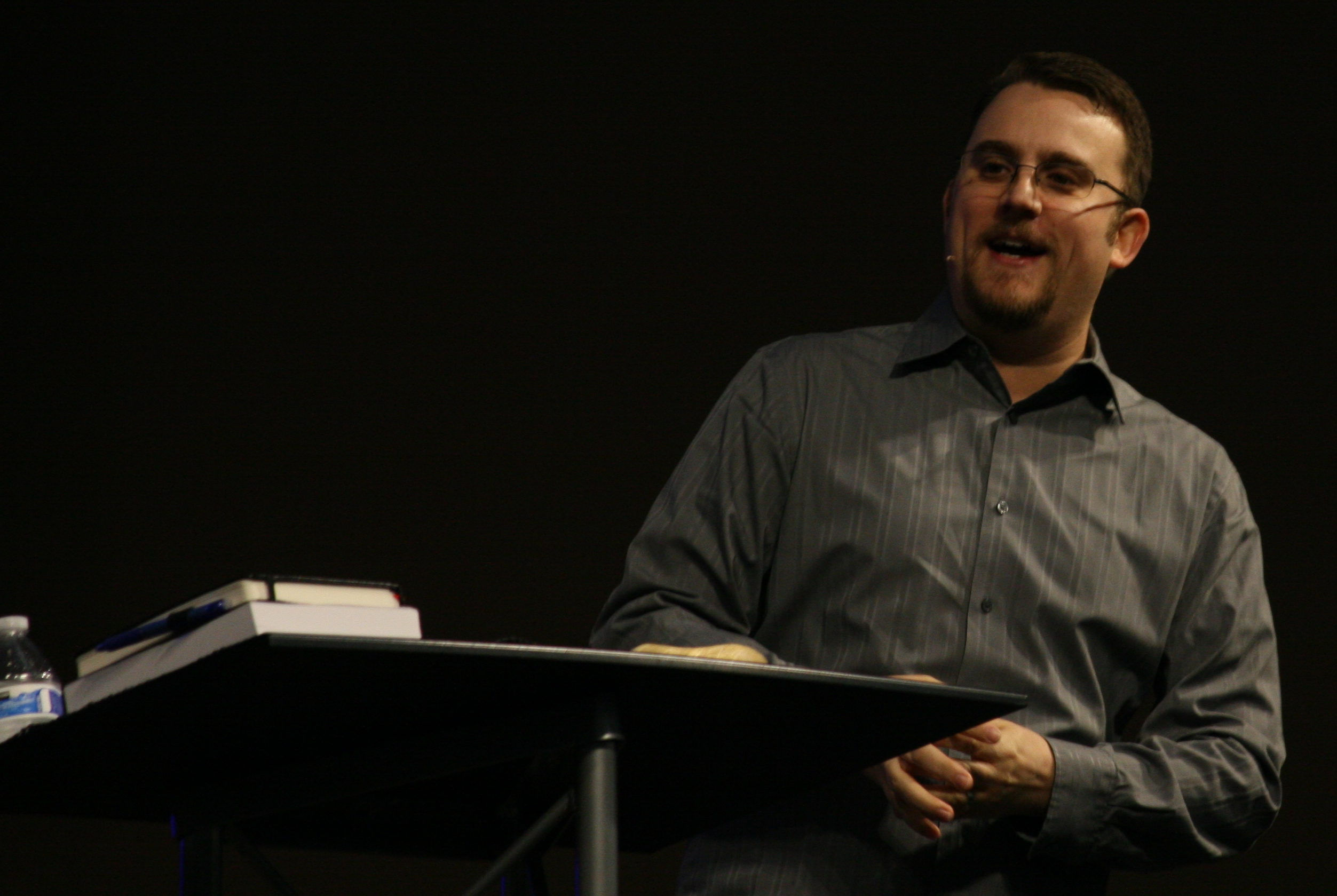
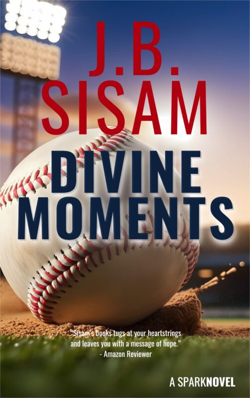
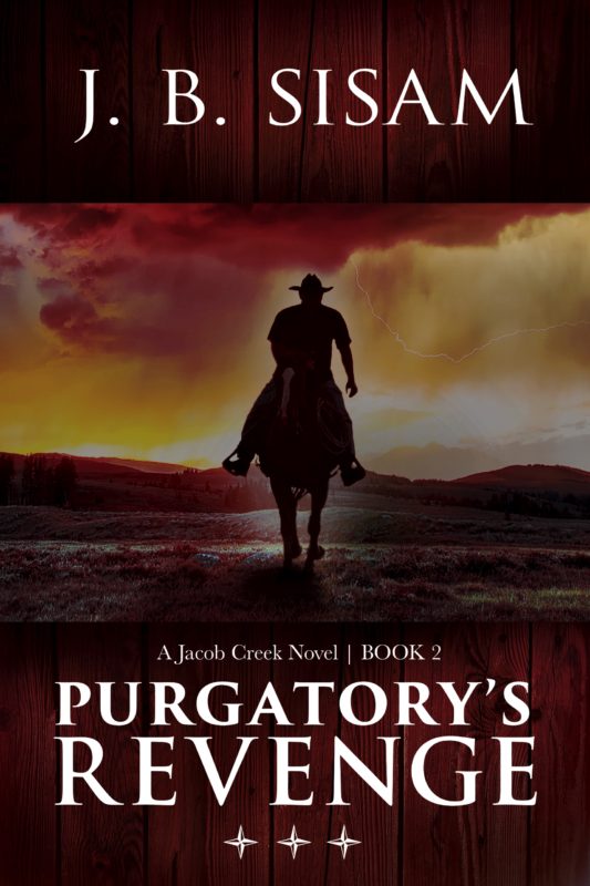
 Jason (J.B.) Sisam. Best-selling Amazon author of the Christian Early Reader book,


LEAVE A COMMENT HERE:
Please note: I reserve the right to delete comments that are offensive or off-topic. Also, this is a clean website, use of any language is not tolerated and your post will be deleted.