I love change. It’s what keeps me moving forward, knowing that something better is on the horizon. This is the reason I’ve redesigned my blog. I know something great is coming.
[featured-image single_newwindow=”false”]
Over the past couple years I’ve played with several designs, but the overall look was tried by thousands of other bloggers and it didn’t serve my vision as I had hoped. Also, my branding at J. B. Sisam has outgrown WordPress.com.
Michael Hyatt said; “If your branding doesn’t represent you, you’re not serving yourself or your audience.”
I knew that I had to get out of the WordPress.com scene. It no longer worked for where I am heading. I’m wanting to build the J. B. Sisam brand beyond just a blog, but something that can serve and help people find their voice and stay motivated with clarity. I knew for that to happen, it was time to take my blog to the next level. It was time to go self-hosted and buy a professional theme that would allow me to focus on building a professional brand.
I knew that if I remained at WordPress.com I would never be able to sell or offer great deals to products and services to my readers. I’ve been blogging at jbsisam.com since 2009 and I was long overdue for an overhaul.
When I began blogging, this site was meant as a place for me to write weekly devotionals to our young adult ministry at Life Church. After a hiatus in 2012-14, I decided it was time to begin blogging again.
In 2014 I made the conscious goal of blogging regularly. And in November 2014 I did just that. As I’ve been blogging regularly for the past year, I’ve realized that my audience wants to learn more about the world of blogging, leadership and getting their voice heard.
This is the new blog! I really hope you like it. This blog is designed from Michael Hyatt’s Get Noticed! Theme. Some of the functions and layout is the same, but it’s been given a huge boost. I wanted to take the vision I have for this blog to the next level and give you something that you’ll enjoy coming back to each week.
I want to give you 5 reasons why I redesigned my blog.
- It was for you, my audience. I knew from conversations I’ve had that people were wanting more information on taking their voice to the next level. Even though I work on staff as a pastor, giving senior pastor advice is something that was just outside of my reach as I had zero experience in that area of ministry. But one thing I know, I have a vision to help people take their message to that next level. And from the success I’ve seen here on this blog tells me people want that message.
- I needed a brand. I teach people how to brand. What it takes to brand their organization, something I didn’t do very well myself. It was time to drink my own koolaid. One thing I’ve learned in Platform University is creating a story within your brand. It was time to finalize what it is that I do. I didn’t wan to be the person with all the answers, but I knew I needed you to be the hero of your own story.
- A new logo. I’ve had three different logos since starting this blog, and none of them touched on the vision I had for this blog.
While each had their own unique identifier, they didn’t really speak what I was trying to communicate. Each have been done numerous times by numerous other bloggers/organizations etc. It was time to refresh. After months of planning and designing I finally realized what I needed and the new logo was born. I feel this logo represents my core vision of helping people find their voice. - A new design and feel. Since I began blogging in 2009 I have been on the free WordPress.com platform. While it’s been a great platform to start blogging on, I knew I needed to become a serious blogger and WordPress.com was no longer able to do the job for my growing audience. Enter the Get Noticed! Theme. This is a theme for a self-hosted WordPress blog. Once I understood where I wanted to go, I could use this amazing theme to craft a better blog and a more compelling design for my brand.
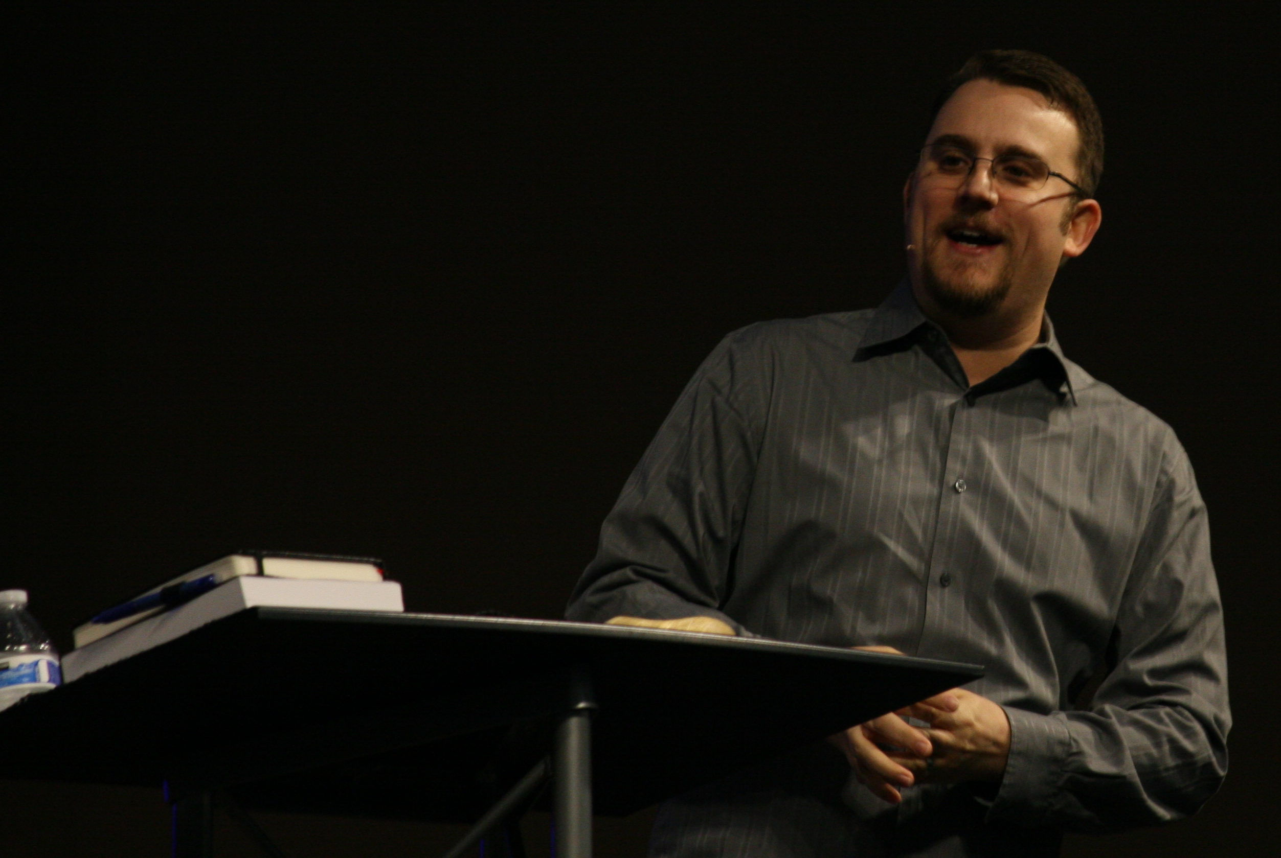
- New photos. I knew that if I was to take this site to the next level, I needed new headshots. So, I enlisted the help of my sister, Jessica Callison–a professional photographer–to capture new images. In the blogging world, images are everything. And i couldn’t be happier with the new images. Thank you Jessica!
- Easier to share. I believe one of the greatest things a blogger can do is help people share their content more easily. It’s now easier and quicker to share content from this blog to your favorite social media channel.
- A new opt-in incentive. I believe having a great opt-in experience helps extend influence. Last year I created an opt-in for Small Group leaders; Start your Engines: 3 Strategies to running an effective small group now.** Though this was a very good ebook, it did not serve my audience the way I thought it would. I wanted to create something that would offer value and help you take your message to the next level.
I wrote a short ebook called: *Inside my Tacklebox: 32 apps to make your life and business soar. If your on the email list, I’ve already sent you the download link, but if you’re not, simply register below with your email and we’ll get you a copy for free!
I desire to take things to the next level. I hope this website comes to serve you and your needs for many years to come. In-fact, I’m excited for 2016–I have some great things in-store for you, and if you’re on my mailing list, you’ll be the first to know.
[reminder]What do you think of the new design?[/reminder]


 Jason (J.B.) Sisam. Best-selling Amazon author of the Christian Early Reader book,


LEAVE A COMMENT HERE:
Please note: I reserve the right to delete comments that are offensive or off-topic. Also, this is a clean website, use of any language is not tolerated and your post will be deleted.